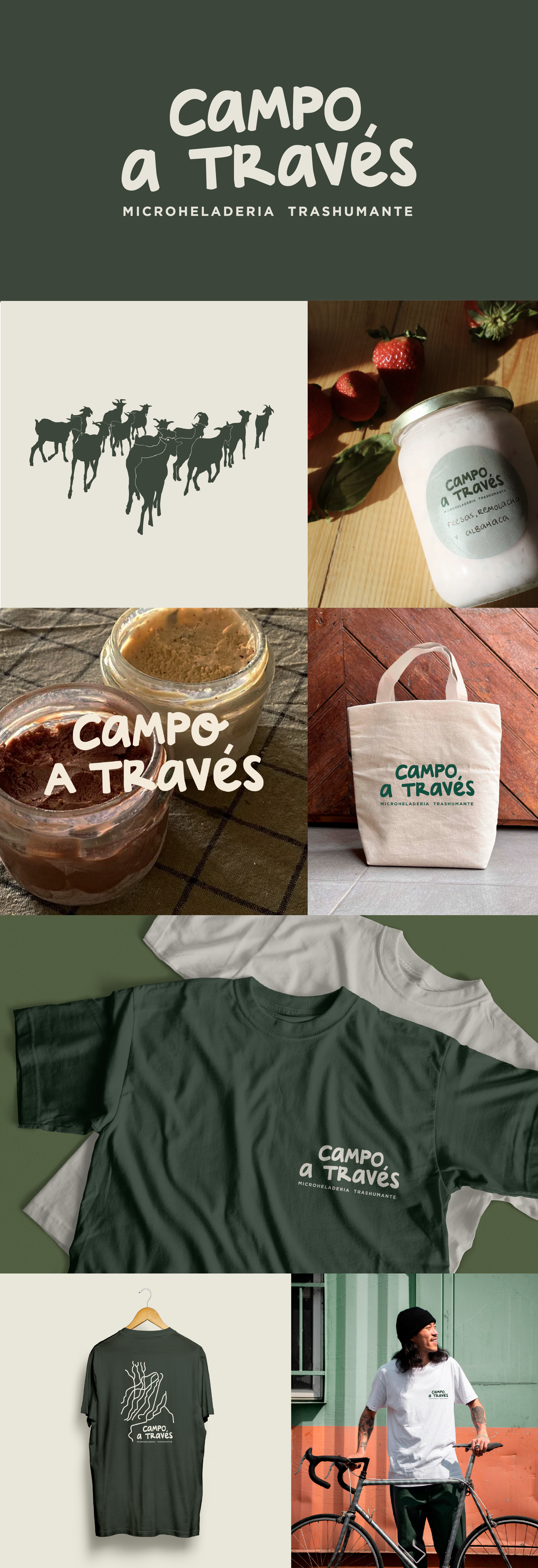
Campo a través is a local micro ice-cream workshop in the northern mountain ranges of Madrid, Spain. Their ice-creams are made with goat's milk, making use of a local herd of goats in the region.
The brand’s ethos is all about using traditional grazing methods, adapting their offer to changes in nature, soil and the seasons. Their products are completely natural and artisan, therefore their stock is local and limited.
The brand identity reflects their philosophy and brings a sustainable feel to the forefront with the use of an earthy colour palette. The branding doesn’t take itself too seriously, it tries to convey the joy the owners experience from working with nature and creating a product that can only put a smile on its consumers. That’s why I chose to create a handwritten font that feels playful and charming.
Campo a través
Brand Identity
Brand Identity
Art Direction
Logo Design
Illustration

